Understanding Data Visualization Techniques
In the rapidly advancing realm of artificial intelligence, data visualization techniques have emerged as essential tools to decode complex results. As AI continues to play a pivotal role across industries, understanding its outputs becomes crucial. The ability to visualize data allows professionals to navigate the often overwhelming sea of information generated by AI systems, facilitating clearer analysis and more strategic decision-making.
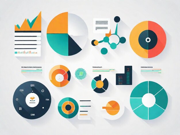
Data visualization transforms intricate datasets into visually accessible formats, enabling stakeholders to grasp insights quickly. These visual representations can bridge the gap between raw data and actionable insights; they serve as a universal language that simplifies the complex narratives hidden within extensive datasets. Some prominent techniques include:
- Infographics: Engaging visuals that summarize data in a digestible manner, often combining text, images, and data points to tell a compelling story. For instance, an infographic can illustrate how AI algorithms are utilized in healthcare to predict patient outcomes, showcasing statistics alongside innovative visual elements that highlight trends.
- Heatmaps: Color-coded representations that highlight trends and patterns within datasets. Used frequently in web analytics, heatmaps reveal user behavior on websites, allowing businesses to optimize their layouts for improved user experience and engagement.
- Dashboards: Interactive displays allowing real-time data analysis that enables decision-makers to have an immediate grasp of performance indicators across various metrics. A dashboard might showcase sales data for a retail chain, updating in real-time to reflect current inventory levels, sales trends, and customer engagement metrics.
These techniques not only promote clarity but also enhance decision-making processes. For example, in the financial sector, effective data visualization tools can highlight risks and opportunities in investment portfolios, enabling financial analysts to make informed strategies based on real-time data analysis.
Moreover, effective visualization encourages a deeper understanding of AI outcomes, which can influence various sectors, from healthcare to finance. By leveraging these powerful tools, professionals can better interpret the implications of AI, driving informed actions and strategies. In some instances, visual analytics can even spotlight potential areas for improvement, thus fostering innovation.
As we delve deeper into each of these data visualization techniques, you will discover how they can significantly improve your comprehension of AI results and applications. The more adept we become at interpreting visually represented data, the more effectively we can harness the power of AI in our respective fields. This progression is not just a trend; it’s an evolution in how we perceive information and make decisions in the age of big data.
DISCOVER MORE: Click here to learn more
The Power of Infographics in AI Data Presentation
One of the most impactful data visualization techniques is the use of infographics. Infographics combine visual elements like charts, images, and text to provide a comprehensive overview of a specific data set. They are particularly effective in presenting complex AI results because they distill intricate information into easily digestible formats. For instance, consider how an infographic can convey the success rates of various AI algorithms used in predicting stock market trends. By using colorful graphics to represent percentages, associated risks, and outcomes, viewers can grasp the essential details without wading through dense reports.
Infographics are also beneficial in education and training environments where understanding the foundational concepts of AI is crucial. By encapsulating the core functionality and application of AI technologies, these visuals serve as powerful teaching tools, making them attractive to educators and corporate trainers alike.
Harnessing Heatmaps for Enhanced Insight
Heatmaps serve a distinct purpose in the realm of data visualization by offering a color-coded view of data that can reveal patterns, trends, and anomalies at a glance. In the context of AI, heatmaps are particularly useful for visualizing data outputs that involve customer behavior analysis. Companies can utilize heatmaps to analyze engagement on their websites, pinpointing which sections captivate users the most and which areas may need improvement.
For example, a retail store’s website might employ a heatmap to track where most visitors click. This information can drive strategic decisions, such as repositioning key products or streamlining the purchasing process. In scenarios where multiple AI models produce results, heatmaps can help stakeholders quickly identify which models are performing best based on available metrics.
The Impact of Dashboards on Real-Time Data Decisions
Incorporating detailed dashboards into AI data analysis enhances real-time decision-making capabilities. Dashboards allow users to visualize KPIs and other vital data in a unified interface. This level of accessibility is crucial for industries like finance to monitor market fluctuations or risks in real-time. Similarly, healthcare providers can use dashboards to track patient outcomes, medication adherence, or even operational efficiency.
A well-designed dashboard offers interactivity that enables users to filter data by various metrics, providing a personalized experience to each stakeholder. For instance, a healthcare dashboard might display patient data, providing underlining trends in treatment outcomes or alerting physicians to potential health risks among certain demographics. This immediate accessibility to critical information underscores the importance of incorporating dashboards into AI applications, effectively enhancing operational performance.
As we explore these techniques further, it will become evident that the strategic use of data visualization can significantly influence understanding and interpreting AI outputs. By utilizing infographics, heatmaps, and dashboards, organizations can transcend the limitations of raw data, paving the way for informed decision-making and innovative strategies.
| Visualization Technique | Description & Benefits |
|---|---|
| Heat Maps | Heat Maps are effective in illustrating the density of data points across a geographic or a two-dimensional space, making complex data easier to understand at a glance. |
| Bar Charts | Bar Charts simplify comparisons between different demographics or time periods, thus aiding in quick decision-making based on visualized AI outputs. |
| Interactive Dashboards | Interactive Dashboards enhance user engagement and allow for real-time data manipulation and analysis, transforming the way we comprehend AI results. |
| Sankey Diagrams | Sankey Diagrams visualize flow and connections within datasets, providing clarity on how different variables interact within AI modeled environments. |
As we explore these techniques, it’s vital to note the impact of effective data visualization on decision-making. Various studies have shown that incorporating visual aids facilitates comprehension and retention of complex data by up to 80%. By utilizing these methodologies, AI results become not just accessible but actionable. The choice of technique often hinges on the audience and the specific insights the data aims to convey. Advanced visualization techniques thus serve as a bridge, fostering deeper understanding among non-experts and experts alike. Each method brings unique advantages that, when employed correctly, can significantly enhance the storytelling aspect of data analysis in AI. As businesses strive to leverage AI innovations, mastering these visualization techniques is paramount to converting data into valuable insights.
DISCOVER MORE: Click here to dive deeper
Leveraging Interactive Visualizations for Deeper Engagement
Interactive visualizations are taking data presentation to the next level by allowing users to manipulate and explore data sets in real-time. These dynamic visual tools enable users to drill down into datasets, filtering by specific parameters or time frames, thereby unveiling insights that static charts simply cannot provide. In the realm of AI, interactive visualizations can effectively dissect complex algorithms, showcasing the relationships between input variables and prediction outputs.
For instance, an organization developing a machine learning model for spam detection could utilize an interactive scatter plot that depicts features like word frequency and sender reputation. By hovering over individual data points, users can understand why certain emails are categorized as spam, leading to greater transparency in AI decision-making processes. This level of interaction not only engages users but also enhances their understanding of how AI models derive outcomes based on varying input conditions.
Storytelling with Data: The Role of Data Narratives
Employing a storytelling approach in data visualization can transform raw metrics into compelling narratives that resonate with stakeholders. Combining visual components with a narrative flow helps contextualize AI results, allowing audiences to visualize the journey taken by the data. Data narratives often utilize a sequential structure that guides viewers through insights, highlighting key discoveries while addressing potential implications.
Consider a nonprofit organization that uses AI to analyze social media sentiment regarding climate change initiatives. Instead of simply presenting processed data in isolation, the organization could weave a narrative around their findings. For example, starting with a visualization of rising sentiment recognition over time, they can then follow up with visuals representing key events or campaigns that contribute to the shifts in public opinion. Not only does this approach leverage visuals to relay information effectively, but it also builds a connection with viewers, fostering a deeper emotional resonance with the subject matter.
Enveloping Results in 3D Visualizations
As data complexity continues to grow, 3D visualizations are emerging as powerful tools to represent multifaceted datasets comprehensively. By visualizing AI results in three dimensions, stakeholders can gain insights that may not be easily interpreted through standard two-dimensional charts. These visualizations are particularly useful when analyzing multidimensional data pertaining to customer preferences, market segmentation, or AI model performance.
For instance, in an automotive manufacturing context, a 3D visualization could illustrate the relationship between production variables such as time, cost, and defect rates across various models. By manipulating the 3D model, decision-makers can identify optimal production parameters—in essence, visualizing the effects of changes in real-time and forecasting potential outcomes. This interactive capability enriches data interpretation, empowering businesses to make informed decisions based on complex AI-generated insights.
Conclusion
Integrating multiple visualization techniques—from interactive graphics to compelling storytelling and advanced 3D models—empowers organizations to translate AI results into actionable insights. As companies continue to adopt AI technologies, the strategic application of these visualization methods will be paramount in bridging the knowledge gap between technical developers and non-technical stakeholders. In doing so, they can bolster understanding, trust, and ultimately, the successful implementation of AI solutions across various sectors.
DISCOVER MORE: Click here for insights
Conclusion
In the rapidly evolving world we live in, characterized by overwhelming data streams, the ability to distill and communicate AI insights effectively is of paramount importance. The use of data visualization techniques enables clearer understanding among varied audiences, making complex AI results accessible to both technical experts and non-technical personnel alike. For instance, techniques such as interactive dashboards and visually engaging infographics transform intricate datasets into digestible formats, allowing stakeholders to quickly assess key information without getting lost in raw data.
Moreover, utilizing compelling storytelling alongside these visualizations plays a crucial role in fostering a deeper understanding of the data. When a narrative guides the viewer through the data, illustrating trends and highlighting key findings, it not only enhances retention but also encourages engagement. For example, case studies showcasing how AI is applied in healthcare have demonstrated that visual narratives can effectively communicate the implications of AI-driven patient care, thereby encouraging informed decision-making among medical professionals.
Additionally, the advent of immersive 3D models and augmented reality (AR) platforms has redefined user interaction with data. Taking automotive design as an example, manufacturers can now visualize performance analytics in 3D, allowing stakeholders to explore various scenarios and configurations interactively. This not only enhances understanding but also stimulates creative solutions to challenges previously deemed too complex to tackle.
As organizations embrace these innovative data visualization strategies, they must prioritize versatility to cater to an increasingly diverse audience. Whether it’s depicting sales trends or environmental impacts, the ability to effectively convey insights from AI should continually evolve to meet the needs of all users. In this context, the marriage of AI and visualization technologies represents a significant leap towards operational effectiveness, improved collaboration, and successful strategic initiatives. Ultimately, as the demand for AI-generated insights grows, so too does the need for sophisticated yet accessible visual tools that ensure these insights are not merely observed but truly understood.
Related posts:
The Impact of Real-Time Processing on Decision Making in AI
Ethical and Privacy Challenges in Data Processing for Artificial Intelligence
The Impact of Data Preprocessing on the Accuracy of Artificial Intelligence Models
The Intersection of Data Processing and Artificial Intelligence in the Financial Industry
Innovative Strategies for the Integration of Unstructured Data in Artificial Intelligence Projects
The Role of Real-Time Data Analysis in Enhancing Artificial Intelligence Systems
Beatriz Johnson is a seasoned AI strategist and writer with a passion for simplifying the complexities of artificial intelligence and machine learning. With over a decade of experience in the tech industry, she specializes in topics like generative AI, automation tools, and emerging AI trends. Through her work on our website, Beatriz empowers readers to make informed decisions about adopting AI technologies and stay ahead in the rapidly evolving digital landscape.